Log in
Log in

PAC/Oversight Resources
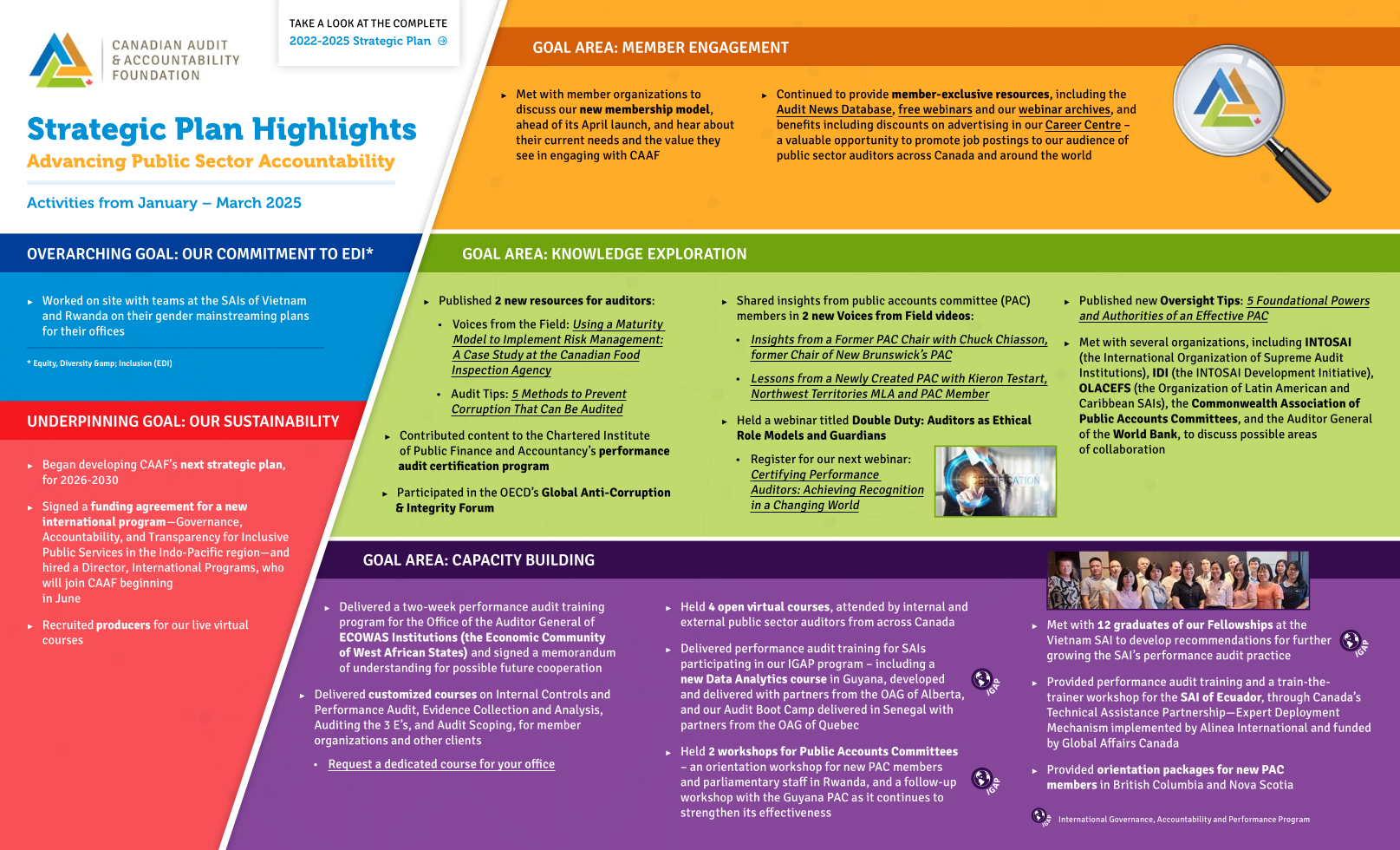
CCAF’s oversight program supports oversight committee members and their support staff. We provide research, material and professional development workshops to oversight committees both in Canada and abroad.
Our support enables parliamentarians to become familiar with their role and improve the effectiveness of their committees. This includes information on understanding performance audit, and how these audits can help improve public administration.
Read More...
- Performance Audit Resources
- PAC/Oversight Resources